Website Design
This project was researched, designed, and project managed by me over the course of six months with the goal of increasing clarity/functionality for the end user. Research was conducted with multiple targeted surveys, meetings with executives, and data backed by Google Analytics. This project was executed thanks to our website vendor’s programming team while I provided a overall timeline and milestones.
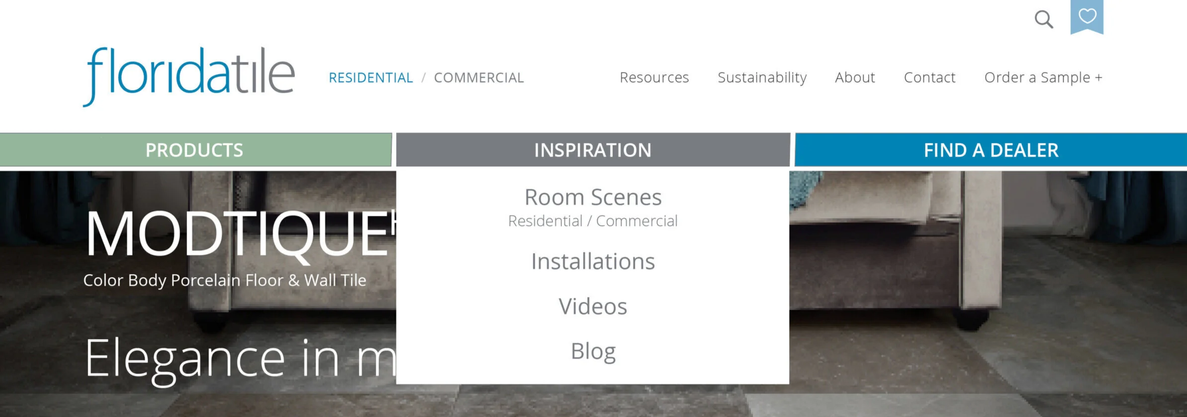
2020
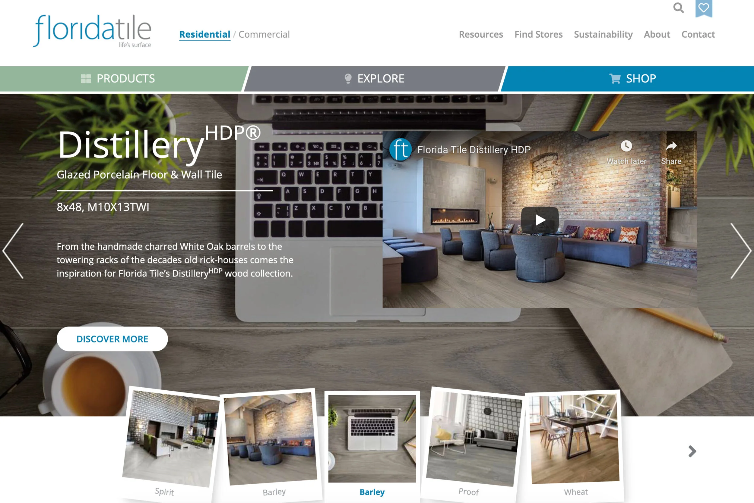
2018
Homepage
Shop can be a misleading title as we do not offer any kind of online purchasing of our product
There is no immediate way to get to samples
The videos cause visual clutter to the banner, taking away from the beauty of our imagery
Drop shadows and off angle adds nothing to the sophistication of the brand.
Homepage
Clarity for customers with an updated look and navigation
New taglines added to each collection to make them pop
“Order a Sample” in the top right-hand corner allows for quick access to the samples page and your cart
“Find a Dealer” button; adds more clarity to the functions of the button versus “Shop”
Improved user experience, through tight navigation will reduce the confusion for all visitors
Removing frustration will give us the chance to become an education destination for our products and the industry
Products Menu
Collections, and products should be priority when it comes to this tab
Currently this tab is filled with a ton of filters that, while showing you that we indeed have a bunch of tiles, can be overwhelming to the customer
It’s cluttered and does not scale that well in mobile view
Products Menu
The menu will now span across the whole screen broken up into three clear sections
Makes “All Collections” more prominent, because the purpose of this website is to show them all the awesome and diverse collections, we offer
New clean, responsive display will make mobile look and function better than ever
Increased clarity with larger font will keep us not only accessible for all ages, but functional on any device
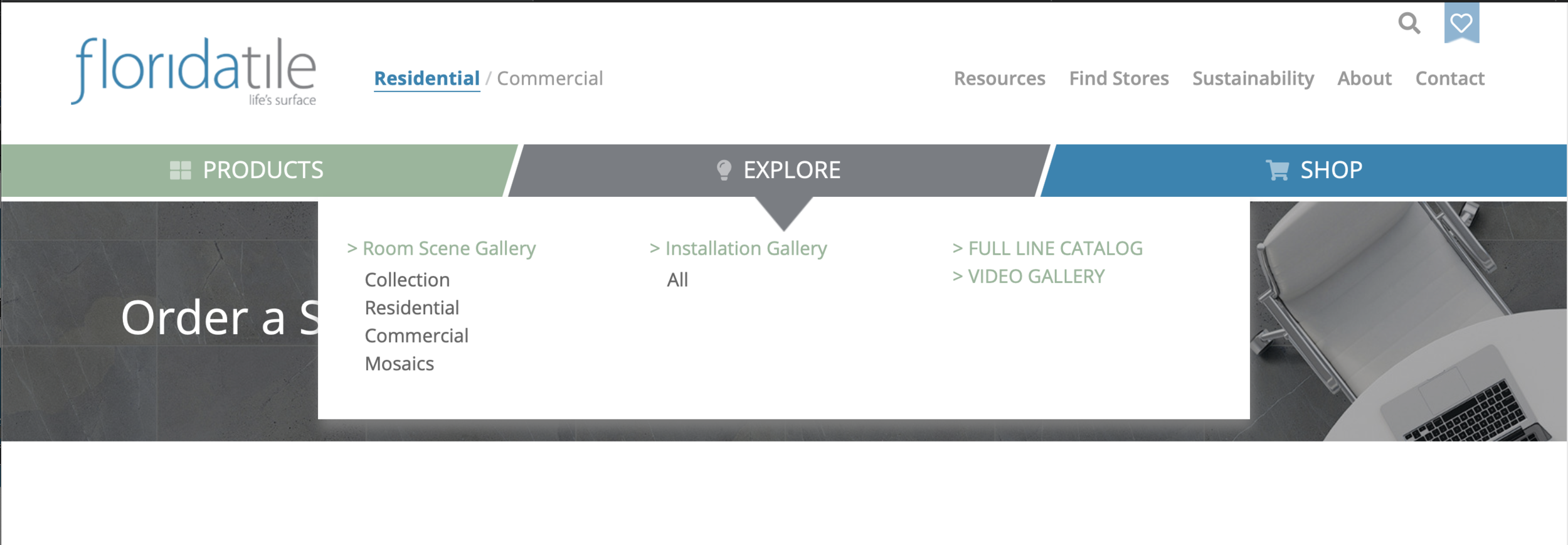
Explore Menu
There is no consistency to this tab when it comes to the layout of the clickable titles
Explore doesn’t quite live up to its current name as this is where we have some of the least content on the site
NEW - Inspiration Menu
The goal of this tab is to show off Florida Tile’s creativity, whether it’s our room scenes, installations, videos, or blogs
These are areas that we are constantly improving on
Increased clarity, will again make us a leader in simple navigation, something that a lot of our competitors are currently lacking
New location for our blog, which will provide a good source of new content for our customers that should be updated regularly
Shop Menu
The “Shop” tab is not a clear indicator of what this drop down actually does
While it provides you with locations that you can purchase tile, a more proper name for this tab is “Find a Dealer”
This tab also suffers from spacing issues, clarity, and usability for the users on our site
NEW - Find a Dealer Menu
“Find a Dealer” is a much more appropriate name for this tab as it’s the main place to find the store locator, along with other helpful location information
Increased clarity and spacing will improve the usability of this tab on the computer and on mobile
Keeping the ”Order a Sample” in this location, because it doesn’t hurt to have it in two locations
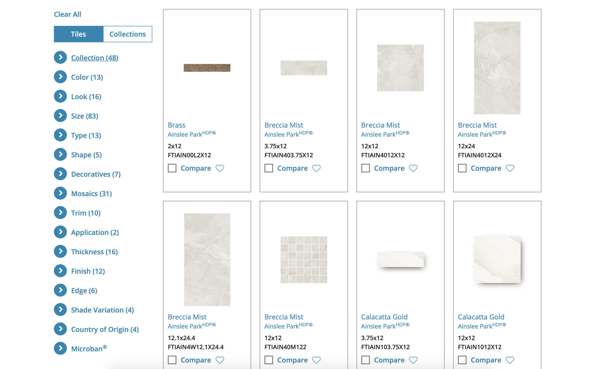
Product Search
The current product search is cluttered, and does not represent the Florida Tile that we are building
Ainslee Park-HDP currently takes up a page and a half of the search. This does not make for an enjoyable user experience
We need to feed information to our customers in easy, intuitive bite size pieces. This philosophy will help both new and returning visitors to the site
This current system is all but unusable on mobile
Product Search
Completely revamping the way that we show off our tiles in the ”All Products” search to add clarity to the page
The search now shows a representative color for each tile, then when you click, it will give you all the formats and some technical about that tile
Adding the sample order button on this page feeds into the idea of a navigational loop
This allows us to show off multiple collections on one page
Another benefit of this view is that it will scale excellently with mobile devices. Currently, when on your phone you can only see one tile at a time. Which means that you must scroll a very long time until you start seeing other collections
The new mobile view will allow for two colors side by side, doubling the amount of information the customer will see at a glance
Sample Order Search
The current sample order page does nothing to help the customer order a sample other than providing them a wall of SKUs
A great system for internal FT users, but not for the common customer visiting the website
Provides no information on what tile you are getting making it extremely hard to know what you are ordering
It’s difficult to be creative with three samples, which is why I think we should increase that number to five
This will bring us more in-line with our competitors
Sample Order Search
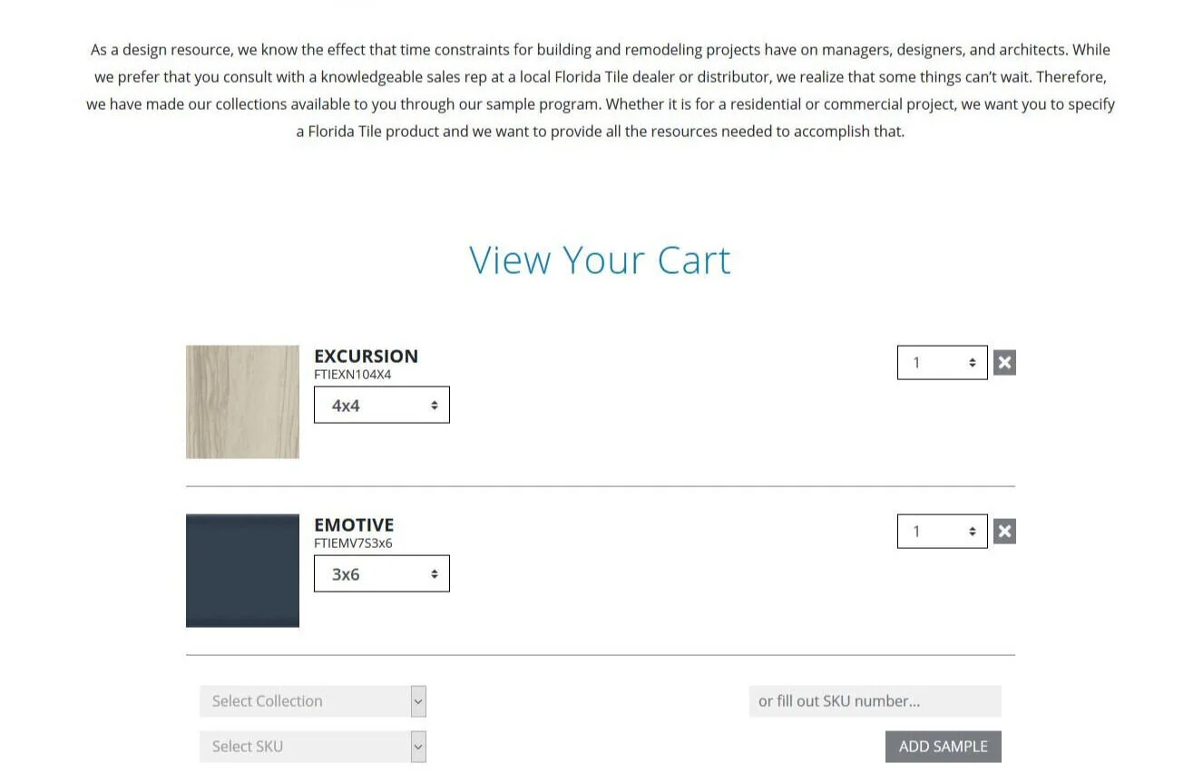
This replaces the current three box sample order process on our current site
Inspired by the design of the pop-up and other carts used on popular websites
This view gives you all the information that you need to comfortably order your samples
Having the visual mirror the pop-up reinforces that our website works the same no matter which page you are on
Clicking “add a sample” will give you the same boxes the current site gives you, so none of that old code goes to waste, but what comes out if it will be a clean, clear, and concise
